Jobs in Service
A hire-on-demand marketplace for service industry employees.
Summary
My stakeholder, Mr. Sosa has worked in restaurants as both an employee and as a manager. He encountered a range of challenges when it came to scheduling labor. His vision is to create an app that allows restaurant workers and managers to have more flexibility in their life.
Roles and Responsibilities
Jenna Jacobs
UX/UI Designer
Alberto Sosa
Stakeholder, Developer
Timeframe
4 Weeks
Deliverables
Competitive Analysis
Personas
Journey Map
User Stories
User Flows
Wire Frames
High Fidelity Prototype
Project Scope
The Problem
When restaurants are short-handed, it can impact the success of a shift. The customer service suffers which results in lost revenue.
Hiring temporary workers is time consuming and opens up a whole bunch of risks. Employees may no-show or be underqualified.
The Audience
The users of this solution are restaurant owners, managers, and workers. For the purpose of this case, we will be focused on managers and owners.
The Solution
An app that allows managers to find, hire, and pay workers all from their phone.
Process
Quantitative Research
This survey was designed to:
Provide context for the problem (average staff size, frequency of turnover, etc.)
Discover the key demographics of the users
Discover goals and challenges or users in relation to the problem
50-75 People
The most common staff size
33% have this staff size
6-12 Months
The most common duration of employment
33% say 6-12 months and 17% say 1-3 years
1-3 People
The most common number of people hired a month
50% say they hire 20-30 people per year
Desktop Computer
Preferred this device for recruitment
67% say they use the computer and 14% say they use a phone
Qualitative Research
The user interviews were conducted to discover if managers were hiring temporary workers, what were the pain points for these employers and how they were currently addressing them.


What I found to be consistent among these users was that their hiring needs coincided with their unique selling propositions. Anya needs seasonal workers for the crawfish season, Clayton has to consider the entertainment and service needs while Roger has a catering division that he needs a pool of temps for.
Competitive Analysis
Gigsmart was determined to be my client’s greatest competition. This company serves multiple labor solutions that include temporary, project-based, and permanent recruitment.
Quick is a product that is most similar to the app my client intends to create. The app exclusively serves the restaurant industry and as a result, they provide content such as blogs and articles to support the users.
Personas
Journey Map
Storyboard
This manager needs to find a staffing solution. He goes through frustration, worry, skepticism, and eventually relief due to the value provided by the solution.
User Pain Points Discovered
Finding qualified candidates
The need for candidate vetting
Control over notification frequency
Participation: motivated to commit to shifts and show up for them.
How Might We. . . ?
Information Architecture
User Stories
I derived several user stories from this How Might We exercise. I prioritized these user stories based on my client’s business requirements. Mr. Sosa wants the minimum viable product, or the minimum functionality to be usable to be addressed first. H wants this so that she can start building the app.
User Flows
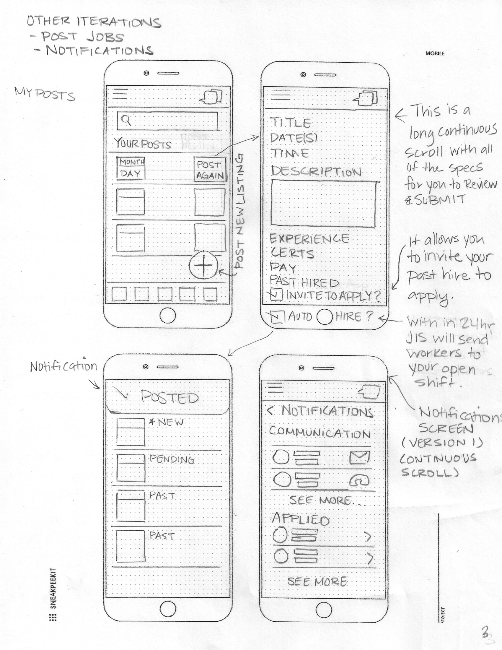
My stakeholder wants to get the product off the ground ASAP and has required me to focus on the minimum viable product. I determined that the highest priority task is posting a job which is also the most in-depth task. I considered designing a Hire ASAP feature that lets you put in the minimum criteria and the app will “auto-hire” based on the criteria you specify.
However focusing on MVP, my aim for this phase zero was to get the product functioning. In later phases, I would create and test solutions that add conveniences for the users.


Wire Frames
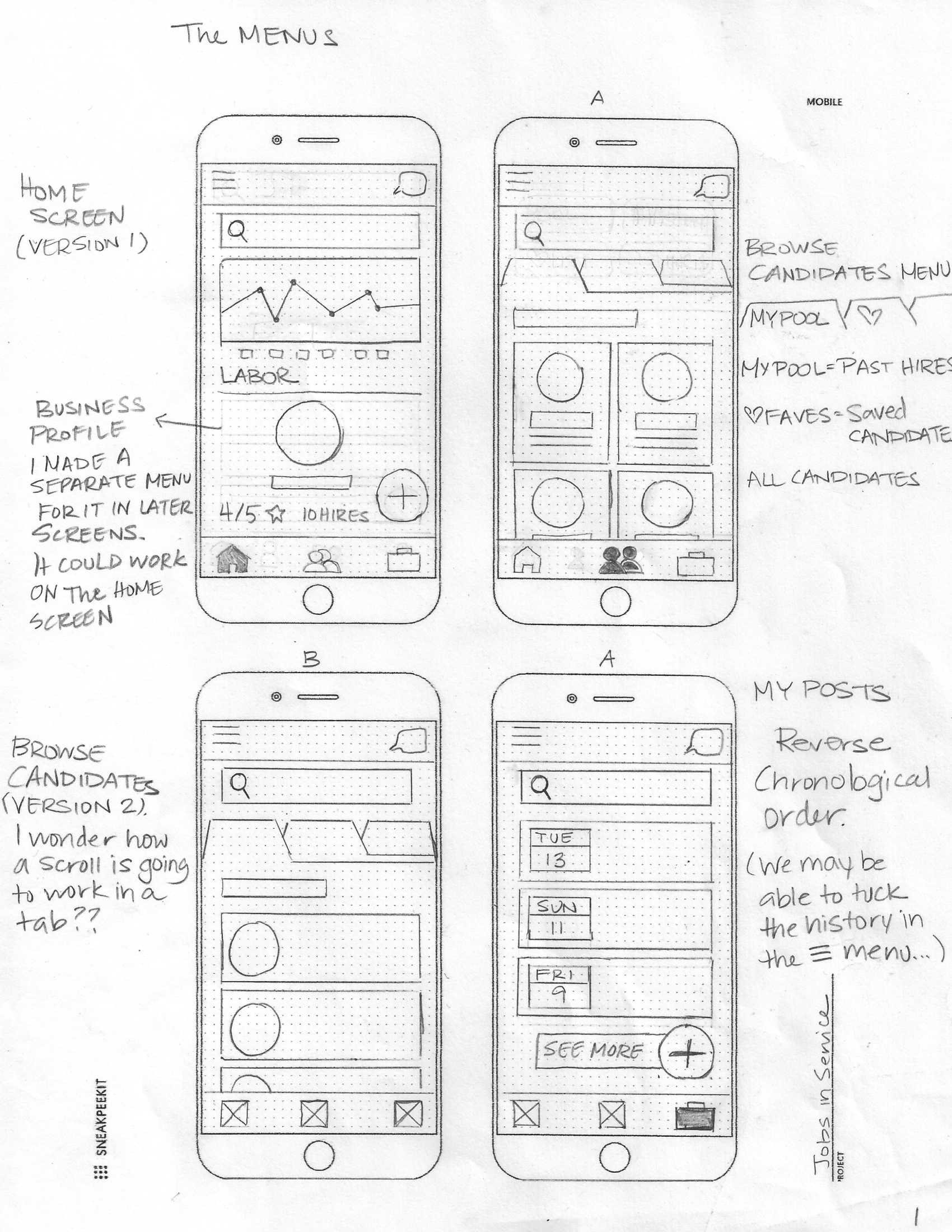
What options would Brandon need to speed up his process at this point? I created the floating task to post jobs for quicker access. I thought about how he would consider candidates in both an urgent and a timely circumstance.
“Hire now” allows the user to bypass the interviewing process and hire their first choice.


Wirefame Iterations


First Iteration
First Iteration Test
Two iterations were completed; the first one was tested with 11 testers and 3 user tests interviews were conducted.
Other Observations
People are drawn more to interactivity (buttons, scroll, etc) than they are to reading; button size, placement, and contrast guide the user.
The low-performance scores of my app have less to do with the design of the tasks and more to do with how intricately I designed the prototype.
People struggled with controlling a skinny scroll bar with a mouse and computer screen. When the keyboard emerged, they didn’t always see it or they felt as though they needed to type something but didn’t know what to write.
Second Iteration
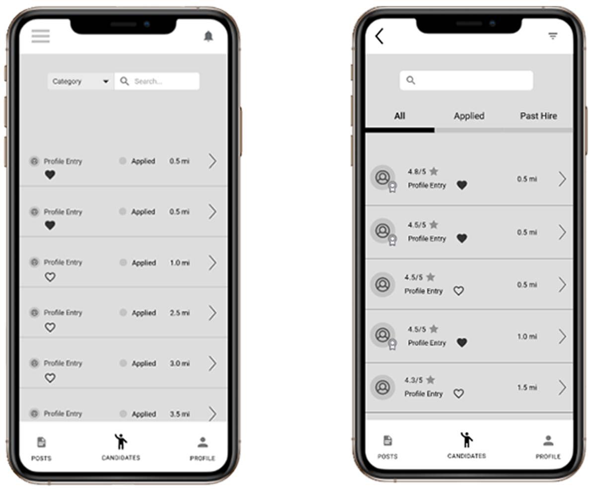
Before & After
Simplifying the prototype addressed a lot of the friction points in the user test. The 2nd iteration was tested by 11 testers and 1 user interview test was conducted.
Learnings
-
In the survey phase, I would ask questions that gauge the impact of being short-handed.
Do you see an increase in voids and comps when you are short handed?
Approximately how much more loss incurred due to short-handedness?
How much does your restaurant gross annually?
when starting the competitor research I sought out products that filled the same needs. After completing the research I realized there are products that address similar products such as Uber. The customers set the terms and workers take work based on their availability and job fit.
-
Overall in working to get a product off the requires a wholistic view of the product. I’m not necessarily considering any one feature but the whole functionality of the app. That being said for the purposes of developing a phase 0 iteration, I may have approached the design with a “broad stroke” approach. Moving forward I will iterate with more specificity for each task. In the immediate future, I will address:
The Review Candidates flow in my UI design to make filtering more sophisticated .
The editing of a screener quiz so that the UI better utilizes the given space.
-
This service opens up the need for other hiring solutions. If an employer hires a temp and they like them they will want to employ them permanently.
In the near future we will have to design a temp pool feature and in the latter future we may develop a feature for hiring permanent workers.
Branding
For branding, I returned to the competitors to find out what could set us apart visually. The following are some notes and observations I made.
The Competition
Navy and gray with a little bit of yellow and orange.
Feels like paperwork.
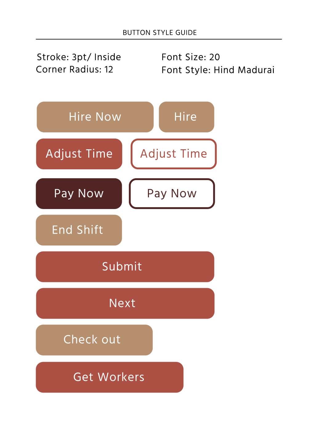
First and foremost, a common theme observed among competitors is the color blue. Linkedin, Indeed, and the preceding all use blue. Secondly is that these hiring apps tend to be text heavy. I propose to include as many icons and images as possible to make the UI more delightful and the experience more enjoyable. I also intend to be disruptive and use a color scheme that doesn't include blue. Potentially using reds, and warm neutrals for that supportive feeling.
Style Tile


High Fidelity Prototype

Final Thoughts
Designing an app from the beginning is starting from scratch. There are so many possibilities and with more development, more is solidified. The limitations increase and shift when more parts come into fruition.
Now after seeing the outcomes, I understand the product to be composed of two existing products. It is a job marketplace and a labor-management app.
When the time comes to designing solutions for the employee-facing side, I foresee the problems being centered around engagement. Motivating those users to take jobs and do quality work will be the problems to solve but they impact the employers.
I look forward to learning more about the relationship between these two users and strategizing how to make this product mutually beneficial to both parties.


